Machine Learning Engineer Nanodegree Capstone Project Report
Note: Code for this project can be found on my GitHub.
1. Definition
1.1 Project Overview
Machine learning is disrupting many industries and health care is one of them. For my final project, I chose to use supervised machine learning to build a breast cancer diagnostic sys- tem.
Machine learning has been successfully applied in medical diagnostics with very promising re- sults. It has been used to analyze images and predict ailments of the heart, breast lesions and nodules, as well as in other areas.
This leads to the following conclusions about application of machine learning in medical diag- nostics. Machine learning can:
- automate medical diagnostics, reducing demand of qualified personnel • outperform professional doctors in certain diagnostic areas
- cut medical costs
- help improve quality of medical services in poor countries
Breast tumors can be malignant (cancerous) or benign. Benign tumors do not represent great danger to a patient. However, a malignant tumor is dangerous and requires immediate treatment. Positive prognosis often times is directly correlated with how early breast cancer is diagnosed in a patient.
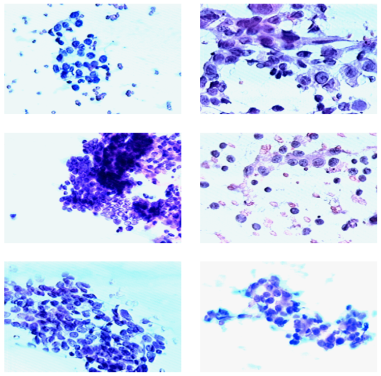
Figure 1: Left panel: benign tumors, right panel: cancerous tumors.
One of the ways to diagnose whether a tumor is malignant or benign is to take a biopsy of a breast mass and then visually examine cell nuclei under a microscope. A trained specialist can then decide if there is cancer or not. Sample images can be seen in Figure 1. Images on the left belong to patents who were diagnosed with benign tumors and images on the right belong to patients who were diagnosed with malignant tumors.
1.2 Problem Statement
In my project, I will build a supervised classification model, that will predict, based on an unseen input data vector $\textbf{x}$, whether a patient has malignant or benign breast tumor.
Im mathematical terms, there is some input $\textbf{x}$, an unknown target function $f:\mathcal{X}\rightarrow \mathcal{Y}$, where $\mathcal{X}$ is the input space (set of all possible inputs $\textbf{x}$) and $\mathcal{Y}$ is the output space (either of two classes: malignant or benign, represented numerically as $1$ and $0$, correspondingly). There is a data set $\mathcal{D}$ of input-output examples $(\textbf{x}_1,y_1),\dots,(\textbf{x}_N,y_N)$, where $y_n = f(\textbf{x}_n)$ for $n = 1, \dots, N$.
The goal of the project is to find such an $f$ that best describes the data.
My solution will be quantifiable, because all the learning algorithms that I intend to use can be expressed in either mathematical (such as a separating hyperplane in SVC) or logical (such as a decision tree) terms. The solution will also be measurable, because I will use well defined metrics such as accuracy, precision, recall and F1. Lastly, my solution will be replicable by the means of running the code provided in the final project and using open-source software tools.
1.3 Solution Statement
To find the best solution, I will implement an algorithm that will test a wide variety of hypotheses (models) and select the most appropriate one based on the metrics described in the Problem Statement section: accuracy, precision, recall and F1.
All the models will be cross-validated on a subset of data reserved for testing. Additionally, I plan to experiment with dimensionality reduction, feature scaling and grid search of hyperparameters.
The models that I am interested in exploring are the models covered in the Unsupervised Learning chapter of MLND.
1.4 Metrics
In order to choose the right metric, we should consider the nature of the problem. Since this is a cancer diagnostic system, the two kinds of prediction errors that can arise do not quite have the same importance. Type II errors (false negatives) should be very heavily penalized by the learning algorithm while type I errors (false positives) can be somewhat tolerated. Consider that it is much more important to get diagnosed correctly when a person has cancer to start treatment as early as possible. If a sick person gets a “healthy” diagnosis and goes home, this will lead to potentially fatal consequences. On the other hand, if the system erroneously predicts that a healthy person has cancer, then additional diagnostics will quickly reveal that there is no problem and the person can safely go home.
To address this issue, the importance of type II errors should be much higher than that of type I errors. Minimizing type II errors implies maximizing recall and minimizing type I error implies maximizing precision. For this purpose, recall should be emphasized as compared to precision, which is not as important.
Let us consider an edge case. If the algorithm disregards precision completely, it can have negative effects as well. Indeed, if the algorithm predicts that everyone has cancer, then recall rate would be at the maximum level of 100%, but such a system would not be very useful in real life. For this reason, precision should not be disregarded.
But how do we choose the right combination of recall versus precision. Let us consider the following form of the F-beta score, which is similar to F1 score, but favors precision and recall, depending on the value of the $\beta$. When $\beta \rightarrow 0$ only precision is considered and $\beta \rightarrow \infty$ favors only recall:
\[F_\beta = (1+\beta^2) \cdot \frac{\text{precision} \cdot \text{recall}}{\beta^2 \cdot \text{precision} + \text{recall}}\]In order to choose the right weight $\beta$, some subjective judgment should be exercised. One way to do this, in my opinion, is to decide how much precision are we ready to give up in order to achieve the perfect recall score. Let us consider that we have two models:
- recall is $0.9999$ and precision is $1.0$
- recall is $1.0$ and precision is $0.8$
The first model implies that on average, one person in $10 000$ will be misdiagnosed as healthy while having cancer and can eventually die because of this, while all healthy people will be correctly diagnosed as healthy. The second model implies that everyone who has cancer will be correctly diagnosed, but $20\%$ of the healthy people will be incorrectly diagnosed as having cancer. I would argue that the second model is better than the first because I believe that the life of one person is more important that the costs of additional testing of $2000$ healthy people to make sure they do not have cancer. These two models are two border cases from which I will deduce $\beta$ by solving a simple inequality that says that the custom F-beta score should favor the second model:
\[(1+\beta^2) \cdot \frac{0.8 \cdot 1.0}{\beta^2 \cdot 0.8 + 1.0} > (1+\beta^2) \cdot \frac{1.0 \cdot 0.9999}{\beta^2 \cdot 1.0 + 0.9999}\]This means that in order to correctly favor the second model against the first one, the weight $\beta$ should be higher than $49.9975$ (given additional constraint of non-negativity of $\beta$). At the same time, precision is not disregarded.
Scikit-Learn package has a built-in performance metric F-beta that I am going to use for this project with the beta value of $50$, which is the rounded value of one that was derived above.
1.5 Project Workflow
My planned project work flow is as follows. Fist, I am going to explore and visualize the data to better understand it. This will allow me to perform feature selection and dimensionality reduction, if needed. For example, I could decide to get rid of highly correlated features. Techniques such as PCA will allow me to see if maybe there are clusters in the data and also to understand which combinations of features are the most important when trying to classify tumors as malignant or benign.
After data exploration I might perform data transformation (rescaling, log-transform, etc). For example, SVC works best on the data that was transformed, such that all the variables lie in the range from $-1$ to $1$1.
The next step will be splitting the data set into subsets for training, grid search and testing the model. At this point it is important to avoid data contamination and I will make sure to never use the test subset in grid search or cross-validation.
After I split the data, I will perform the actual learning, hyperparameter optimization and model selection across the classification models of my choice: Naive Bayes, SVC, decision trees and boosting models. After selecting the best model in each family I will test their performance on the test set that was kept “uncontaminated” to estimate the models out-of-sample performance.
Finally, I will report results and compare them with the benchmark. I will conclude with analysis of the weaknesses of the model and areas for future improvement.
2. Analysis
2.1 Data Set
Data set that I chose for this problem is the Breast Cancer Wisconsin (Diagnostic) Data Set, coming from the UCI Machine Learning Data Repository.
The data set contains 569 observations across 32 attributes. They include the patient ID number, correct diagnosis (malignant or benign) and 30 real-valued numerical variables derived from 10 features described below. The following feature descriptions are excerpted from the paper published by the authors of the original data set2. In addition, the paper contains all the technical details explaining how the data were collected and processed.
-
Radius: The radius of an individual nucleus is measured by averaging the length of the radial line segments defined by the centroid of the snake and the individual snake. Snake is an active contour model used for determining the boundary of a cell nucleus in an microscope image of tissue, in this context it can be thought of as a shape that approximates the shape of a nucleus in an image. All the features are then computed based on the “snake” points.
-
Texture: The texture of the cell nucleus is measured by finding the variance of the gray scale intensities in the component pixels of an image of nucleus.
-
Perimeter: The total distance between the snake points constitutes the nuclear perimeter.
-
Area: Nuclear area is measured simply by counting the number of pixels on the interior of the snake and adding one-half of the pixels in the perimeter.
-
Smoothness: The smoothness of a nuclear contour is quantified by measuring the difference between the length of a radial line and the mean length of the lines surrounding it. This is similar to the curvature energy computation in the snakes.
-
Compactness: ($\text{perimeter}^2 / \text{area} - 1.0$).
-
Concavity: Severity of concave portions of the contour.
-
Concave points: This feature is similar to Concavity but measures only the number rather than the contour concavities.
-
Symmetry: In order to measure symmetry, the major axis, or longest chord through the center, is found. The authors then measure the length difference between lines perpendicular to the major axis to the cell boundary in both directions. Special care is taken to account for cases where the major axis cuts the cell boundary because of a concavity.
-
Fractal dimension: The fractal dimension of a cell is approximated using the “coastline approximation” as described by Mandelbrot3.
For each of the 10 features, there are 3 numerical variables, representing the mean, the standard deviation and the “worst” (mean of three largest values).
All the numerical features were extracted from biopsy images, some of which you can see in Figure 1. The data set is clearly relevant to the problem stated because currently similar data is being used when diagnosing malignant and benign tumors. Malignant tumors change the tissue visually, so that it becomes possible to distinguish it from healthy tissue or benign tumors. The variable presented in the data set represent numerically all the relevant attributes that are used to successfully diagnose patients based on biopsy images.
I made an exploratory scatter plot matrix of the “mean” values of the 10 attributes listed above. It can be seen in Figure 3 in the “Exploratory Visualization” section below. Clearly, there is some correlation between some of the variables. This is discussed in the “Data Exploration” section.
2.2 Data Exploration
The data and features were described in the previous section. In this section I will focus on details of the data set that are more relevant to the machine learning part of the project. The very first feature, id, is the patient ID. For the purpose of building a predictive model, this feature is irrelevant and therefore will be discarded. The second variable, diagnosis, is binary and categorical with the values B (benign) and M (malignant). This variable will be the label for the supervised learning problem as defined above. The values will be encoded to 0 and 1 for the purposes of training.
The remaining 30 features correspond to the 10 real-valued numerical attributes as described in the previous subsection. For each attribute, there are 3 features:
- mean value of attribute itself (for example,
radius-mean); - standard error of the attribute values (for example,
radius-mean-se); - the ”worst” value for the sample. Data point corresponds to one biopsy and has many cell nuclei, therefore it is possible to choose the worst value from many cells (for example,
radius-worst)
Full list of features can be seen in the Jupyter notebook that comes with this report.
This data set is a very good data set to work with. There are no missing values and all the values are real-valued. This means that I do not need to care about data imputation and categorical variable encoding, which saves a lot of work.
Next thing that I think is important to understand for the purpose of a supervised machine learning classification problem is how balanced classes are. In this data set, the two classes are slightly imbalanced: 37% of values are benign and 63% are malignant. This should not be a big problem, but in order to minimize the effects of unequal classes I can perform stratified train-test splitting when performing learning and evaluating performance of classifiers.
Another fact that is important is shapes of distributions of values of all 30 numerical variables. In general, all of them exhibit a positive skew, that is, the right tail is very long. This fact tells us that for each feature, most of the values are small, but also there are relatively few very large values. The shapes of the first 10 variables can be seen in the scatter plot matrix in Figure 3.
One possible solution to the positive skew is to apply log-transformation, which will result is a shorter tail and a better-looking scatter plot and an easier job for a classifier. When applying log-transformation, it is important that all the values are positive, because the real-valued log function is not defined for negative values as well as for zero. The problem for this particular data set is that all some variables are strictly positive, and some are non-negative. The standard practice of dealing with log-transforming of non-negative data is to add one before taking the log: $x’_i=log(1+x_i)$. This will ensure that we get mathematically correct results even when $x_i = 0$.
Additionally, it might be a good idea to deal with the outliers. It is a very difficult decision to make, because outliers are not necessarily bad. There is no reason to believe that the outliers present in the data are produced by errors in handling biopsy samples. However, removing extreme outliers can sometimes help increase a model’s performance, so I will further address this issue.
2.2.1 Random Subset of Features
To give a better feel about the data, I decided to take a random sample of only 4 features from the feature space and then present their summary in the Table 1 presented below.
The first row tells that there are 569 observations for all selected features. The rest of the rows present various quantitative descriptions that allow us to get a sense of the distribution of data. In particular, by observing the last two columns, it can be seen that the maximum value lies very far from the median as measured in interquartile ranges, especially the perimeter-se feature. Additionally, all the selected features are positive and real-valued.
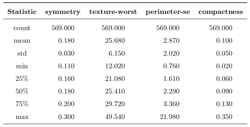
Table 1: Description of a random subset of four features from the feature space.
To summarize this part, these are the following important characteristics of the data set:
- all explanatory data points are non-negative
- many features exhibit very large positive skew
- presence of extreme outliers can be observed
- range of some features is very small (such as 0.110—0.180 for
symmetry-mean), yet for others it is much larger (such as 143.5—2501.0 forarea-mean). This can present challenges for some classifiers, such as SVC, so data transformation is needed - there is visual distinction between clusters of benign and malignant tumors. This means that we can expect a successful application of supervised machine learning to this problem
- the clusters are overlapping, i.e. they are not clearly separated in a pair-wise scatter plot
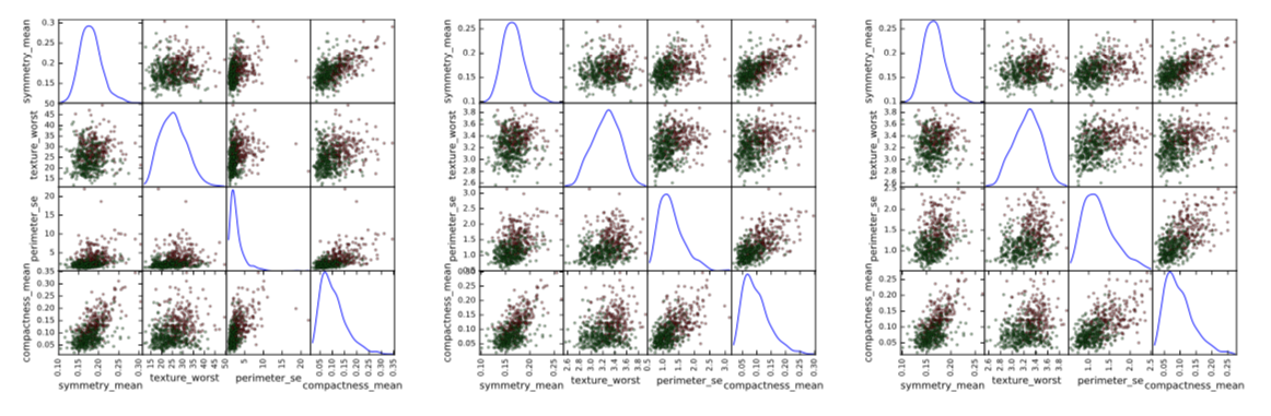
Figure 2: Left: original data; center: log-transformed data; right: log-transformed data with outliers removed. Green points: benign tumors; red points: malignant tumors.
2.3 Exploratory Visualization
In order to illustrate some of the points outlined in the previous subsection, I decided to visualize the same 4 features that were randomly chosen in Table 1.
In Figure 2 there are 3 panels. In the left panel, there is a scatter plot matrix for the original, untransformed features. In the central panel I applied log-transform of the form $x’_i=log(1+x_i)$. Please note how this transformation changed the distribution shape of the third variable, removing a very long right tail. In the third panel, I removed the outliers: data points that are further than five interquartile ranges from the median for at least one dimension. This removed 14 data points.
As result, shapes of scatter plots changed quite dramatically. Of course, in this visualization only four features are presented, but if we look at all the 30 features, we can see that a two-step preprocessing of log-transform with consequent outliers removal changes the shape of distribution for variables with very large right tails.
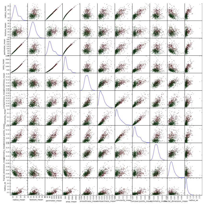
Figure 3: Scatter plot matrix of the mean values of the 10 features. Green points represent benign tumors; red point represent malignant tumors.
I also provided a scatter plot matrix for the mean values of the 10 attributes in Figure 3. All the characteristics described in the previous section can be clearly seen. In addition, there is another interesting pattern: there seems to be almost ideal linear relationship between radius and perimeter, and almost ideal quadratic relationship between radius and area and also between perimeter and area. This is because both perimeter and area are functions of radius. This also makes it a rather clear statement that these features are redundant in a sense that they do not bring any new and unique information that can help to improve performance of algorithm.
2.4 Benchmark
The benchmarks that I am going to compare my results against have been published in “Com- parative Analysis of Different Classifiers for the Wisconsin Breast Cancer Dataset”4. These results can be seen in Table 2. The models used as benchmark are SVC with diferent kernels, as well as Random Forests, ANN and Naive Bayes. Not surprisingly, Naive Bayes demonstrates the weakest performance across all competing models.
I intend to examine whether my implementation can show superior results as compared to the benchmark. If I will not be able to outperform the benchmark, but show similar results, then, I believe, my work will still have value because I will have reproduced and confirmed results published before and my work can be a reference point to someone doing a similar problem in the future.
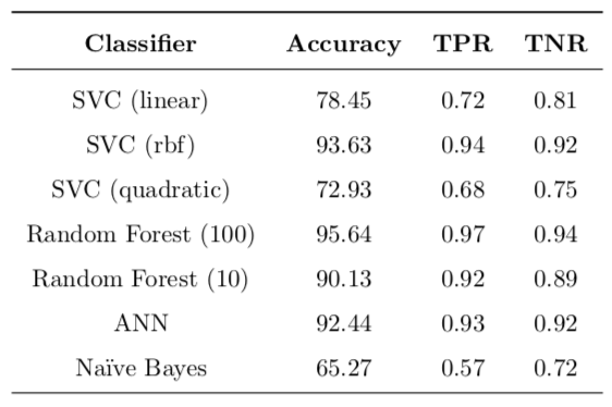
Table 2: Benchmark models: accuracy, true positive (TPR) and true negative (TNR) rates are reported.
2.5 Alorithms and Techniques
My choice of models for this project is partially motivated by the list of benchmark models outlined in the previous section. Therefore, I will use the following classifiers:
- support vector classifiers with linear, quadratic and radial basis function kernels
- random forests with different number of trees in the forest
- Gaussian Naive Bayes classifier
- AdaBoost classifier
I decided not to include artificial neural networks, because they are harder to implement and they are not stable in terms of replicability and they also tend to get stuck in local optima. Additionally, there are many decisions that need to be made to make an ANN work such as type of network, topology, complexity and so forth. I believe that simpler models can provide very good performance without all the disadvantages of ANNs.
In addition to not including ANNs I decided to add an AdaBoost ensemble classifier. When taking MLND I was fascinated by the idea and elegant mathematics5 underlying boosting algorithms and so I am really curious whether it will be on par with other classifiers.
The rubric for the capstone project says that I need to discuss all algorithms used. I am not going to cover technical details, only providing a general idea behind each model:
-
plain vanilla SVMs try to fit a separating hyperplane that will separate data points. For this most basic type of SVM the solution only exists if the data is linearly separable. Introducing regularization parameter $C$ allows for misclassification penalty and the kernel trick maps features into a higher-dimensional (possibly infinite-dimensional) space and lets the model deal with highly non-linear data.
-
random forest is an ensemble method that creates many independent decision tree classi- fiers trained on different bootstrapped re-samples of training data and then allows them to ‘vote’ on unseen data, which is an idea behind bagging. This trick allows to deal with overfitting that regular decision trees are prone to, by reducing variance of the model and therefore increasing its performance.
-
Naive Bayes classifier uses training data and Bayes’ theorem to assign a probability that an unseen data point belongs to each possible class. This classifier is very fast and simple (it is essentially a long chain of multiplication of conditional probabilities) but it usually provides poor classification performance, partially because of its assumption of feature independence which is very strong and is seldom true in real life applications. Another benefit of this classifier is its ability to online learning, i.e. it is possible to update the model with new data without full retraining on all previous data. It is very handy but will not be used in this project.
-
AdaBoost is another ensemble method, but unlike random forests and bagging, it uses the idea of boosting to reduce bias of the model and therefore improve performance. It trains a set of weak learners (ones that only slightly better at classification than pure random guessing; decision trees by default in scikit-learn) in order to create a strong learner (one whose guesses are well correlated with true classification). The classifiers in AdaBoost are not independent, each consecutive classifier is weighed more heavily to focus on data points which were misclassified by the previous classifiers. After training, all classifiers in ensemble will ‘vote’ to determine the class of an unseen data point.
In addition to using models described above, I am going to use the following techniques:
-
stratified shuffled trained-test splitting. The classes are slightly imbalanced, therefore stratified sampling will make sure that both training and test sets will have the right percentages of samples in each class. Randomized shuffling will make sure that the order of data points in the data set will not affect the outcome of training.
-
grid search of hyperparameters for model selection. To fine tune performance of a model the right value of parameters needs to be found. Grid search goes through a hyperparameter space and evaluates the model performance with each set of parameters. It then returns the set of hyperparameters that maximizes the model performance. To avoid overfitting, k-fold cross-validation is usually performed and the set of hyperparameters is chosen based on an estimated out-of-sample performance.
-
dimensionality reduction, such as
PCA. Dimensionality reduction can help to deal with the curse of dimensionality by reducing the number of features, especially if the original features are not independent or the number of features is very large (not in this case). This can help increase performance of the model because while the number of data points available for training stays the same, the number of features can be reduced, thus increasing performance. -
feature rescaling. Even though this step is not necessary for all models described above, it is highly recommended that features are scaled to be in range (−1, 1) for support vector machines. Therefore I am going to use
MinMaxScalerto make sure that all values of all features lie in the same interval. -
sklearn.pipeline.Pipeline. Pipelines are very useful, because they allow to chain together many steps of data processing and a final estimator. In addition, scikit-learnPipelineprovides compatibility withGridSearchCVthat not only allows to estimate the optimal set of parameters for the final estimator, but also to find optimal parameters for all data transformations preceding final estimation. For example, it is possible to find an optimal number of components forPCAat the same time as optimizing for the number of trees inRandomForestClassifier
3. Methodology
3.1 Data Preprocessing
The data set for this problem comes in a form of comma separated values file (.csv format). Pandas package has built-in functionality to read .csv files directly in memory and store them in pandas.DataFrame object.
Upon reading in the data I examined it and discarded the first column, which contains identifi- cation codes of sample and thus is useless for the machine learning.
The next step was to log-transform the data. Motivation and justification for that was already outlined in Section 2.3. Due to large positive skew in most of the features I applied log-transformation of the form $x_{ij}’=log(1+x_{ij})$, where $x_{ij}$ is an original value from an $j$-th dimension of $i$-th data point and $x’_{ij}$ is a transformed value. Before taking the log I added $1$ to all values in order to deal with the fact that $log(x)\rightarrow-\infty$ when $x\rightarrow0^+$. By adding 1 and then taking the log, all the transformed data points are now also non-negative, just as they were before transforming. Additionally, this transformation is monotonic. This means that relative orderings of all data points are still as they used to be, only distances between the points have changed. In particular, extreme outliers are now closer to the rest of the data points.
After log-transforming the data I removed extreme outliers. Standard convention is to consider a data point that is farther than 1.5 interquartile ranges from median an outlier. However, for this problem, I consider this definition inappropriate, because it would remove 253 data points, many of whom belong to malignant class and therefore are crucial to learning distinctions between malignant and benign tumors.
After trial and error, and trying different values I decided to remove any data point that is more than five interquartile ranges farther from median. This effectively removed 14 data points. The way data looks after performing these steps for a subset of 4 features can be seen in Figure 2, which was already discussed above.
The next step was separating target labels from explanatory features. I stored the labels in a pandas.Series object called y and all the 30 features across 555 observations in a pandas.DataFrame object called X.
3.2 Basic Implementation
I started implementing my model building process by coding up a very basic set of classifiers. For this first iteration, I decided to go with estimators that are listed in Table 2, with the exception of artificial neural networks, which will not be considered in this project due to various reasons. I also decided to add AdaBoost to the list of models.
All of these classifiers were instantiated with the default hyperparameters, and then 10-fold cross validation was performed, on each step one fold was held out for test purposes and the remaining 9 folds were used to train the classifier. These results represent an unbiased estimate of out-of-sample performance, according to Abu-Mostafa6.
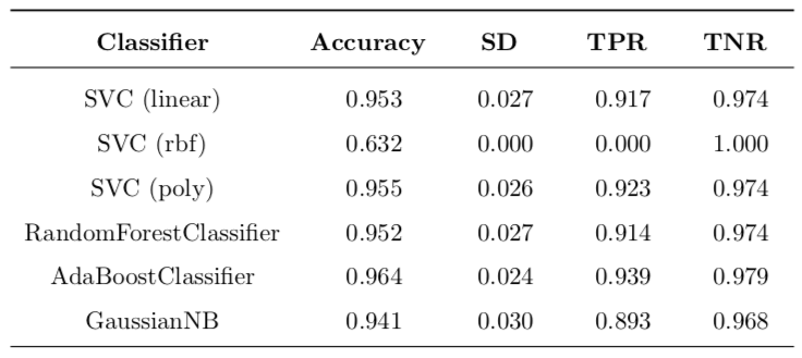
Table 3: Basic implementation with untransformed data.
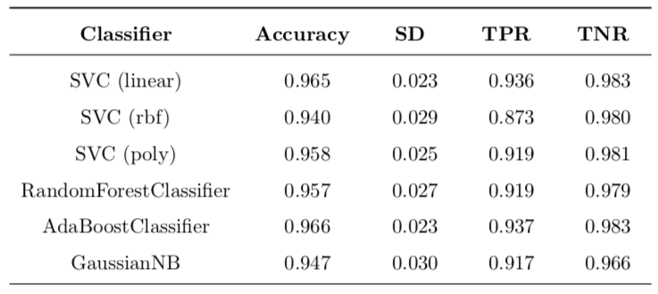
Table 4: Basic implementation with log-transformed data and removed outliers.
3.2.1 Experiment: Does log-transform and outlier removal increase performance?
Even though I am confident in my motivation behind log-transform and outlier removal, I don’t want to be blinded by my assumptions and so I decided to see if these steps do make practical sense. For that purpose I decided to do basic implementation with two different sets of data:
- original untransformed features with all data points present
- log-transformed data with outliers removed
The results of this very basic experiment can be found in Table 3 and Table 4. Note that the performance metric used is the default one, which is accuracy for all selected classifiers. In order to make is easier to compare results of these two tables I calculated a table of improvements for each cell, calculated as follows:
\[\text{Improvement} = \frac{\text{value}_{\text{new}} - \text{value}_{\text{old}}}{\text{value}_{\text{old}}}\]In Table 3 the most interesting case is SVC with rbf kernel. When trained on unmodified data, it produces a classifier that classifies all data points as benign, no matter what. Because there are simply no positive classifications, this causes TPR to be 0.0. For the same reason, there is a perfect TNR score of 1.0. The accuracy is around 63% because of the stratified splitting, the test set will have around that percentage of negative labels. So, after transforming the data, this situation is much improved and TPR goes from zero to around 87%, which is a huge improvement. This means that transforming the data allows SVC with rbf kernel to work properly.
All changes can be found in Table 5. The most important change is for SVC (rbf) with 48.8% boost in accuracy and ‘infinite’ improvement of TPR (this is because the original value was zero). Another important difference is decrease of 12.7% in standard deviation of accuracy. This means that variance of model is lower, which is a good thing. All the other changes are so small that they could be contributed to statistical error and definite conclusions cannot be made.
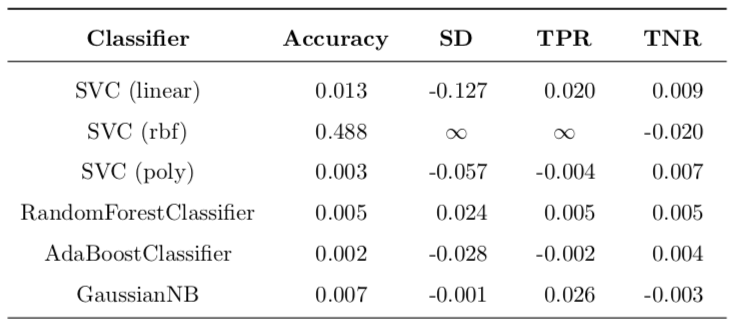
Table 5: Improvement of transformation over untransformed results.
Overall, I must say that log-transforming the data has benefits for SVC (both linear and rbf kernels) and does not have any drawbacks at this point. For this reason I conclude that it makes sense to proceed with refining models based on log-transformed data without outliers.
3.2.2 Does basic implementation beat the benchmark?
The benchmark results were discussed above in the corresponding section. The results can be found in Table 2. Improvements of log-transformed basic implementation over the benchmark can be found in Table 6.
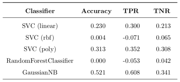
Table 6: Improvement of basic implementation over benchmark.
It is very interesting to note that the linear and quadratic SVCs out of the box outperformed the benchmark, as well as Naive Bayes classifier. Radial basis function SVC with default parameters performed rather poorly as compared to the benchmark (the same accuracy, improved TNR, but worse TPR). The random forest classifier outperformed the benchmark with 10 trees in the forest, but performed worse than the random forest with 100 trees (same accuracy, improved TNR, but worse TPR).
To conclude this section, out of the box SVC (both with linear and quadratic kernels), as well as Naive Bayes outperform the benchmark. SVC (rbf) and RandomForestClassifier perform slightly worse than benchmark.
In the following section I am going to refine the models. In particular, I will perform data preprocessing and PCA dimensionality reduction, as well as hyperparameter optimization using exhaustive grid search.
3.3 Refinement
I decided to refine the model using the following 3 techniques:
- feature scaling using a simple
MinMaxScalerthan makes sure that all data points are in the same range - feature engineering / dimensionality reduction using Principal Component Analysis
- tuning hyperparameters of all chosen classifiers
Feature scaling is a logical step given that SVC works best when features are scaled1. For the purpose of this work all log-transformed features will be scaled to be in range (−1, 1).
PCA analysis allows to extract orthogonal features in the original n-dimensional hyperspace that point in the direction of largest variance of data points. It is a very useful tool, as it allows to deal with the curse of dimensionality. Additionally, I am inclined to believe that some features simply do not contribute too much information, such as relationships between radius, perimeter and area described above. I could simply remove these features by hand, but I will count on PCA to do it for me. Also, I do not know if there are other hidden relationships in the data.
I chose PCA analysis in particular, because it is suitable for features that tend to be normally distributed7. Of course, it does not seem to be true that they are very close to be normal, but my log-transform with outlier removal definitely made shapes of distributions look more alike bell-shaped curve.
Each of the models that I selected to explore in my capstone project has some hyperparam- eters (with the exception of GaussianNB) that can be tweaked that can improve a model’s performance.
In order to put all these steps together in practice I used scikit-learn’s Pipeline. It allows to combine several preprocessing steps and put an estimator at the end and treat this object as a single estimator that has .fit() and .predict() methods. The data flows through all preprocessing steps and is eventually passed to an estimator at the end. In my case, the data flow is as follows:
Another very nice thing about pipelines is that, when used with GridSearchCV, not only they allow to tune hyperparameters of the classifier, but also all parameters of all preprocessing steps preceding the classifier in the pipeline. As such, I can tune the number of features in the PCA transform and even the scale of the data scaling step.
I implemented all this functionality in piper() method. It takes the data and a classifier, then builds a pipeline, creates a grid of parameters to be tuned and passes them to an instance of GridSearchCV to perform cross-validation. This method returns a trained GridSearchCV object from which optimal parameters can be extracted and performance measured. Note that the gird of parameters will be different depending on the classifier used. I implemented get_pipeline_param_grid() method to create a gird of values depending on classifier that is used by the piper() method.
To calculate results for all classifiers and tune hyperparameters for all of them automatically I wrote improved_nested_calculate_results() method. Its purpose is two-fold:
-
model-selection using functionality of
piper()method (i.e. grid search and cross-validation to avoid overfitting) -
evaluation of out-of-sample performance of the model selected
It essentially implements nested cross-validation where there are 2 cross-validation loops: an outer one and an inner one. The outer loop splits the data in two subsets: it reserves a part of data as test set and keeps it ‘hidden’ from the inner loop. The other part of data is passed to the inner loop and this data is used to find the best model, itself being multiple times split as training and validation sets. Then this best model is used together with the outer loop’s test set to get a sense how the model will perform in the real world.
This nested design allows to select the best model, evaluate its out-of-sample performance and at the same time avoid data contamination.
To summarize this section: I implemented a nested cross-validation design to select the best model for each of the six classes and then evaluated their out-of-sample performance. Results are discussed in Section 4 “Results”.
3.4 Experiment: Does $F_{\beta=50}$ Scoring Function Increase TPR?
In section 1.4 I derived beta of 50 that would value false negatives much higher that false positives. I thought a scoring function penalizing heavily false negatives during training would increase TPR rate. For this purpose, when training a refined model, I did it in 3 runs with different scoring functions:
- the default accuracy scorer
- $F_1$ scorer
- $F_{\beta=50}$ scorer
After spending much time for all 3 runs of nested cross-validation for all 6 models selected I discovered that changing the scorer did not improve neither TPR, nor accuracy. All these metrics stayed roughly the same, with the exception of standard deviation, which went up for both $F_1$ and $F_{\beta=50}$ scorers. For this reason for the final refined model I stick with the default accuracy scorer when discussing results in the next section.
I provided all relevant performance results for all 3 scorers in the Jupyter Notebook that comes with this report, but I do not believe that including all those tables here would be a good idea. At this point I must say that it was quite disappointing to see that my initial hypothesis did not hold true, but it is a valuable lesson, because our assumptions should not affect our hypothesis testing and negative results are also results.
4 Results
4.1 Model Evaluation and Validation
The final results for a set of validated models of each class is reported in Table 7. These is expected out-of-sample performance to be seen on new data. The leading model class is the support vector classifier with the linear kernel. It is the best model class overall. It provides expected false negative rate of 3.9% which is the best across all classes in my project. This is still higher than false negative rate of the best model of benchmark, which is 3.0%. For other metrics my best model beats the best model from the benchmark, which is the Random Forest (100):
- accuracy is higher (98.2% vs. 95.64%)
- TPR is lower (96.1% vs. 97%)
- TNR is higher (99.4% vs. 94.0%)
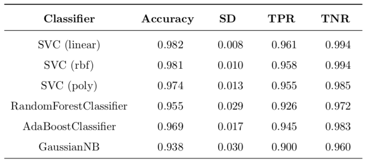
Table 7: Refined implementation with accuracy scorer. Nested cross-validation (stratified shuffle split) with 10 folds both in inner and outer loops (100 folds in total). Test size in each fold is 0.15.
Table 8 presents improvements for each refined model class over all classed presented in the benchmark. As can be seen, a substantial improvement has been achieved in all models except for the random trees.
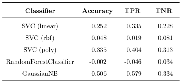
Table 8: Improvement of model refinement over benchmark for all model classes.
Let us examine one set of coefficients obtained during nested cross-validation. Nested cross- validation essentially selects one set of best model parameters for each of the outer loops, and these parameters are not guaranteed to be the same, because the data set are different each time.
Because the best model appears to be the linear SVC, there are only two parameters that were optimized in the pipeline during the grid search cross-validation (inner loop): regularization parameter $C$ for the linear SVM that penalizes for misclassification and the number of PCA components used for training. For regularization parameter $C$, the possible values were $(10^{-3}, 10^{-3}, \dots, 10^{2}, 10^{3})$ and for the number of PCA components they were $(2, 5, 10, 15, 20, 25)$.
The most popular best $C$ parameter was $1.0$, and the most common number of parameters was 20 (see Figure 4).
4.2 Justification
In order to justify my results with statistical analysis, I performed a t-test of differences in means for two samples, alternative hypothesis being that the refined model’s mean accuracy is larger than that of the basic implementation (for linear SVM). The first sample is for 100 cross-validation run of untuned linear SVC and the second sample is 10 runs of the nested cross validation described above.
An outline for procedure can be found online. The t-value obtained (calculations are in the Jupyter notebook) is −2.2822 and corresponding p-value is 0.0122 which is in favor of hypothesis that my refined model is significantly better than basic model.
Finally, the model seems to have a very good accuracy of 98.2%, which means that we expect that percentage of cases to be classified correctly. TNR is 99.4%, which means that we expect a person who has a benign tumor to be diagnosed correctly; TPR is 96.1% which means that out of 100 people with malignant tumors who take the test, 96 will be diagnosed with malignant tumors and 4 will ba misclassified as having benign tumors.
Of course, in real life this is not acceptable, but can be a very good starting point in developing a base for a more complex diagnostic system.
5 Conclusion
5.1 Free-Form Visualization
Since the nested cross validation used in this work chooses the best model multiple times, the best parameters therefore can be different on every loop. I ran outer loop 10 times ans so there were 10 best linear SVC models on each run and they did not have the same values for regularization parameter $C$ and the best number of principal components used by PCA preprocessor in the pipeline.
For this reason I decided to plot counts of best parameters on all runs of cross-validation, they are presented in Figure 4. As can be seen, in the range of 7 parameters in the grid for $C$, 4 of them ended up selected as the best model at least once. The most common value of the parameter is $1.0$ and therefore, if I were to supply a ready model to the client, I would say that a linear SVM with $C=1.0$ would be a good model.
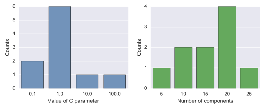
Figure 4: Frequency plot of best parameters for linear SVC for different splits of data.
As for the number of PCA components best used situation is more controversial, out of 6 possible values for number of components in the grid, 5 ended up being selected at least once. The leader is 20 components. But this value of 20 was not only selected when $C=1.0$, but also for other values of $C$. To examine the number of components better, I ran additional simulations. I used SVC with linear kernel and value $C=1.0$ and ran it 100 times for different randomized test-train splits for each value of number of PCA ranging from 1 all the way through 30. Results can be found in Figure 5 below.

Figure 5: Relationship between the number of PCA components and the out-of-sample performance (accuracy). 99% confidence intervals are also reported.
It seems that the number of PCA components that maximizes out-of-sample performance is 13 or 14. Surprisingly, when increasing the number of components beyond that number, neither performance, nos variance of performances gets much worse. This hints that at this point there is not much curse of dimensionality present. Were the number of feature much worse, it is quite possible that we would see decline as the number of PCA components increase.
5.2 Reflection
In this project, I built a cancer diagnostic system based on numerical features, extracted from images of breast biopsies. I used Wisconsin Breast Cancer Data Set, because it is widely used and additionally, there are real-life functioning diagnostic systems build used these data and publications presenting benchmark results against which to compare my implementation’s performance.
The data set was easy to work with, because there were no missing data points. Hard thing for me was working with multidimensional data sets as it is hard to visualize it and so some additional tools were used to better understand the data, such as summarizing features using summary statistics and plotting randomly selected subsets of features. Another tricky part was data preprocessing and outlier removal, as there are no rigorously proved ways to do it. I used my judgment, as well as published research to perform log transformation of features and remove outliers.
After that I chose a set of classifiers and implemented my model in two steps. first I did a very basic training without tuning any parameters and then expanded it to perform more compex modeling. I used scikit-earn’s functionality offered by pipelines to package preprocessing, scaling and training and also minimize data cross-contamination during cross-validation. I then wrapped the pipelines in an additional loop to perform nested cross-validation: the inner loop performs parameters tuning and model selection and the outer loop performs estimation of the out-of- sample performance. This design is used in the industry and allows practitioners to be confident about their models’ performance in the wild.
The final result offers promising performance that beats almost all the models, presented as benchmark, except for the Random Forest. I achieved very high accuracy of 98.2% and TNR of 99.4%, while standard deviation of accuracy is very low, which increases confidence of solution 0.008%. I complemented this by statistical analysis and obtained a low p-value of 1.22% which is in favor of my final model. One area where I am not very satisfied with is TPR ratio, which is slightly lower than the best model in the benchmark. I tried to solve this by introducing a custom scoring function, but experimental results did not show any significant difference, so I abandoned this idea.
There were many challenges with coding part of the project. I wanted to make the process as automatic as possible and so I wrote more than 450 lines of code while implementing methods that helped me achieve desired level of functionality.
During this project I learned a lot both in theoretical areas and more importantly, in how to apply all the knowledge I learned in this Nanodegree to real-world problems. I built confidence in my skills and feel hungry to expand my knowledge and experience. This project has shown me that even a person just starting a path in machine learning can achieve good results even in such areas as medicine where many people think domain knowledge is a must to achieve any insights, but practice shows that it is possible to obtain very good results in cancer diagnostics even without medical degree, which is inspiring.
5.3 Improvement
In my opinion, there are several ways in which implementation could be improved. First of all, it could benefit to try to expand possible ways to preprocess and scale the data before passing it to classifier. It is quite possible that log-transform and outlier removal used by me in current implementation is not the best one. Additionally, the threshold for outlier removal at this point seems arbitrary. It is possible to use cross-validation to determine which threshold is the most optimal. Also, other ways to reduce dimensionality can be explored: not only PCA, but also ICA, SelectKBest and others.
Second, I think that having some domain knowledge about this problem could help to build a model that could better discriminate benign tumors from malignant. This is why it is important to combine domain-specific knowledge with more general machine learning techniques.
Lastly, I believe that trying ensemble method such as Random Forest, but combining is with the current best solution (SVC with the linear kernel) could possibly improve results.
References
-
C. W. Hsu, C. C. Chang & C. J. Lin. A practical guide to support vector classification. (2003). [PDF file] ↩ ↩2
-
W.N. Street, W.H. Wolberg and O.L. Mangasarian. Nuclear Feature Extraction For Breast Tumor Diagnosis. In IS&T/SPIE 1993 International Symposium on Electronic Imaging: Sci- ence and Technology, volume 1905, pages 861-870, San Jose, CA, 1993. [PDF file] ↩
-
B. B. Mandelbrot. The Fractal Geometry of Nature, chapter 5. W. H. Freeman and Company, New York, NY, 1977. [PDF file] ↩
-
L. Vig. Comparative Analysis of Different Classifiers for the Wisconsin Breast Cancer Dataset. Open Access Library Journal, 1, 1-7 (2014). doi: 10.4236/oalib.1100660. [PDF file] ↩
-
This lecture on boosting by MIT’s Patrick Winston is simply amazing! His way of teaching is one of the most insightful approaches to highly technical subjects that I have ever encountered. I am so grateful to MIT for letting students all over the world to learn from such people as him. The lecture on support vector machines is also very good. ↩
-
Y. S. Abu-Mostafa, H.-T. Lin, M. Magdon-Ismail. Learning From Data. AMLBook, 2012. [Website] ↩
-
K. C. Park. Lecture notes for course ASEN 6519. University of Colorado Boulder. Spring 2009. [PDF file] ↩